Caption
Somewhere right now, a designer is staring at a page that is two lines too long. Not two paragraphs. Not two pages. Two lines. The trade has a word for text that won't fit its allotted space—overmatter—and because of those two homeless lines, three people are about to be pulled into a conversation that will outlast the heat death of the print deadline.
This is copy-fitting. Nobody notices it when it goes well, and everyone notices it when it doesn't—which is the least fair deal in all of publishing.
What copy-fitting actually is
Copy-fitting is the noble art of making a variable amount of text fit into a fixed amount of space without making it look like the text was fed through a trash compactor. It's the set of decisions—typeface, point size, leading, line length, margins, and the length of the copy itself—that get words and layout to stop fighting and shake hands.
The catch is baked in. Space is finite and stubborn. Writing has a natural length, and that length is almost never "exactly the space available." It's like packing for a trip: the suitcase won't get any bigger, but somehow you always own one more sweater than physics allows. Copy-fitting is the moment someone has to decide whether the sweater or the suitcase gives.
Why K-12 makes it worse (affectionately)
In most publishing, copy-fitting is a craft. In K-12 educational publishing, it becomes a full-contact sport.
Textbooks are built to a plan, and the plan does not care about your feelings. Page counts are locked by print signatures and budgets, so the book cannot simply grow a page because a paragraph got enthusiastic. A concept is supposed to live on a single spread, so a nine-year-old can grasp long division without a scavenger hunt for the overmatter that has wandered off the page. The worked example, its diagram, its caption, and the practice questions are all expected to appear together, on time, in view, like a well-behaved family photo. Now add grade-level reading requirements, sidebars, callouts, images sized for a reason, and consistency across an entire series.
Suddenly those two lines aren't cosmetic. Those two lines are load-bearing.
What happens when nobody fits the copy
Skip copy-fitting and the page tells on you immediately. Type gets shrunk to sizes best appreciated by ants, and young readers—already doing the heroic work of learning fractions—are handed eye strain as a bonus. A concept gets bumped to the next page, so the example lives here and its explanation lives over there, now emotionally distant. Images shrink until their labels become abstract art. Or white space yawns open so wide the page looks like it gave up halfway through.
None of this is harmless in education. A badly fitted page quietly makes a subject feel harder than it is, and the person who pays for that is the one with the least power to fix it: a kid.
The many, many rounds
Here's the part publishers feel in their bones. Done by hand, copy-fitting is slow, and it is relentlessly iterative.
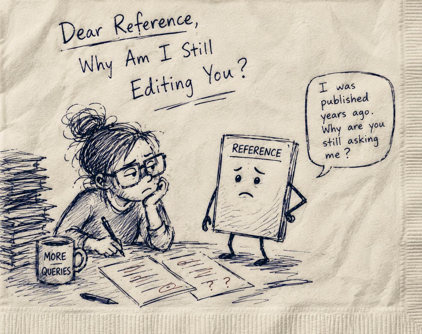
The cycle goes like this. The designer lays out the page and discovers the copy runs two lines long. The editor is asked to trim. The author is consulted, because those two lines might be the exact two that make the whole thing make sense. A revised version comes back. The designer re-flows the page. A brand-new problem surfaces further along in the book, because fixing one spread is like stepping on one bump in a carpet. Repeat. Add email threads debating what "just trim a little" means, several marked-up proofs, and at least one message that says "see attached—ignore my last email."
Multiply that by hundreds of pages and several grade levels, and the rounds stack up—not just in hours, but in sheer coordination friction. Every extra pass is another chance for the wrong version to escape into the wild. It is genuinely skilled work, which is exactly why spending it on "make the carpet flat again" feels a little tragic.
Spare a thought for the author
Copy-fitting also puts the writer in a delightful bind. Authors write to teach, not to hit a character count, and then someone asks them to remove two lines from a paragraph they consider a personal achievement. This isn't just cutting words—it's a pedagogical decision made under spatial hostage conditions. Trim the wrong sentence and the explanation quietly collapses. Refuse to trim and the page breaks. Choose wisely; a nation's understanding of photosynthesis may depend on it.
And often the author is doing this blind—editing a manuscript while somebody else wrestles the layout in another room, another tool, another time zone. They're solving a visual problem without being allowed to see the visual. It's like being asked to parallel park a car you're describing over the phone.
The point, minus the jokes
Copy-fitting sits right where design, editorial judgment, and pedagogy overlap, and it earns far less credit than its difficulty deserves. The goal was never merely to make text fit. It's to make the right text fit, in a way that actually serves the reader. That's hard to do well, harder at scale, and hardest of all when the people who love the words and the people who love the page can only ever meet in yet another round of revisions.
The more that fitting can happen where writing and layout are visible together—early, and to everyone at once—the fewer afternoons get ruined by two lines. And the more the finished page can do what it was always meant to do: get out of the way, so the learning comes through.